Betas of 10 Stocks with Highest and Lowest Return-to-Risk Ratios with Positive Returns in 2019

Using MacroRisk Analytics software, this post will present the betas, up-market betas and down-market betas for 10 stocks out of the S&P 500 Index with positive returns year to date (through 6/10/19) that have the highest and lowest return-to-risk ratios from 12/31/18 through 6/10/19. We first discussed these stocks in another blog post which you can check out by clicking here.

As a reminder, beta measures an asset’s systematic risk or the risk of an asset relative to a benchmark over a certain period of time. It measures systematic risk,  attributed to the market movements (e.g., the S&P 500 Index). It doesn’t include unsystematic risk which is the portion of total risk that is not explained by the market (e.g., company-specific information).  Suppose a stock has a beta of 1.20. This means that over the time period during which this beta statistic was calculated, the stock was 20% more volatile (i.e., riskier) than the benchmark. Suppose the benchmark went up by 1%, a stock with a 1.20 beta would go up by 1.2% and vice versa. If an asset has a beta that is higher than one, it is riskier than the benchmark and while a beta of less than one would indicate the asset is less risky than the benchmark.

In addition to showing the regular betas, MacroRisk Analytics software provides up-market and down-market betas. Up-market betas are calculated using returns information for days when the benchmark returns are positive, and down-market betas are calculated using returns information for days when the benchmark returns are negative. Up-market betas measure how much more volatile an asset is when the benchmark goes up. If an asset has a up-market beta higher than 1, the stock would be expected to have higher returns than the benchmark when the benchmark goes up and vice versa. In this case, the up-market beta (i.e., up-market risk) is the good kind of “risk” or the “risk” of earning more or less money relative to the benchmark when the benchmark goes up. The down-market beta, on the other hand, measures the downside risk. What happens to the stock when the benchmark goes down? If an asset has a down-market beta of less than 1, it tends to lose less value on average than the benchmark when the benchmark goes down and vice versa.

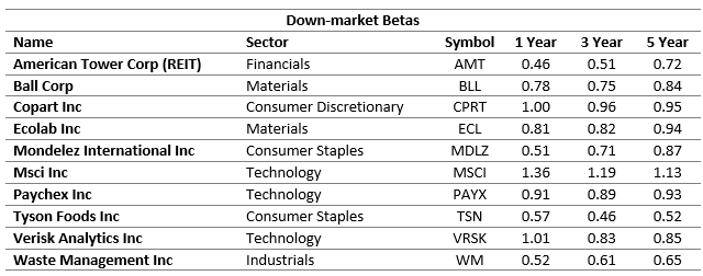
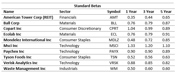
Now, let’s dive into the betas, up-market betas and down-market betas for our stocks. Using the Beta+ Holdings Table provided by MacroRisk Analytics, not only can we quickly get this information, but we can also customize the benchmark (e.g., an index, a ticker, or a previously created portfolio), the period over which we want to calculate the betas for and the frequency of returns. We used the MacroRisk Beta+ Holdings Table to export the beta results using 1, 3, and 5 years of daily returns with the S&P 500 Index as the benchmark to an Excel spreadsheet. The results are summarized below for 10 stocks out of the S&P 500 Index with the highest return-to-risk ratios from 12/31/18 through 6/10/19:
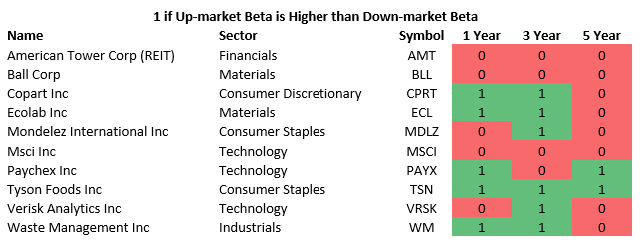
Next, we want to highlight which up-market betas were higher than their corresponding down-market betas. These are the situations when the stock has increased more than the benchmark when the benchmark went up and lost less value than the benchmark when the benchmark went down. We indicate these occurrences with a ‘1’ in the table below:
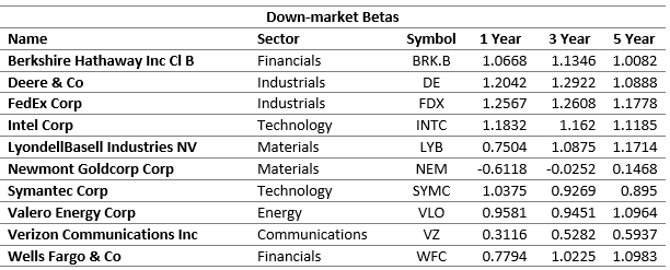
Shown below are the betas, up-market betas and down-market betas for the 10 stocks from the S&P 500 Index with positive returns that have the lowest return-to-risk ratios from 12/31/18 through 6/10/19.
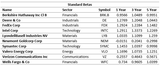
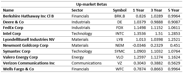
Lastly, we identify which of these stocks had higher up-market betas than down-market betas.

Using these tools, we have presented the betas, up-market betas and down-market betas which can help investors get a better understanding of how the assets have performed relative to the S&P 500 Index, our selected benchmark.

MacroRisk Analytics has a selection of proprietary analysis tools that use macroeconomic variables to provide information on tens of thousands of stocks, mutual funds, exchange traded funds, and other traded assets.   Click here to see how MacroRisk Analytics can help you. 

Economic Outlook for a Stock with the Highest Return-to-risk Ratio in 2019 through June 10

Using patented macroeconomic information provided by MacroRisk Analytics, we will discuss the economic outlook for Tyson Foods Inc. mentioned in our “Stocks with Highest and Lowest Return-to-risk Ratios Year-to-date” blog post on June 12, 2019.

In our previous post, we have identified Tyson Foods Inc. (ticker: TSN) as having the highest return-to-risk ratio out of the S&P 500 stocks from 12/31/18 through 6/10/19. The company’s economic profile as of 6/14/19 as demonstrated in the MacroRisk Report by MacroRisk Analytics is:

MacroRisk Level

The MacroRisk Level (MRL) measures an asset’s sensitivity to economic change (i.e. another measure of an asset’s risk). Tyson Foods’ MRL is 107. Is this number too high, too low? To answer this question, let’s compare Tyson’s MRL to other companies in the consumer staples sector. Using MacroRisk Analytics, we uploaded the consumer staples holdings referencing the XLP holdings (SPDR ETF for consumer staples) as of 6/14/19 into a buylist. Next, we used the FiveRisks+ Holdings Table by MacroRisk Analytics to analyze the sector’s holdings versus Tyson Foods.

Name Symbol MRL
Archer-Daniels-Midland Co ADM 87
Coca-Cola Co (The) KO 103
Sysco Corp SYY 103
Tyson Foods Inc TSN 107
Campbell Soup Co CPB 111
Colgate-Palmolive Co CL 119
Monster Beverage Corp MNST 130
Mondelez International Inc MDLZ 140
Brown Forman Corp BF.B 141
Kimberly-Clark Corp KMB 141

As of 6/14/2019, there were 33 holdings in the consumer staples sector. The tables above show only a few of the holdings within the SPDR Consumer Staples ETF. The tables are sorted by the MRL from lowest to highest. Tyson Foods is similar to Sysco Corp and Campbell Soup in its sensitivity to changes in the economy. Among the 33 holdings in the consumer staples sector, the lowest MRL in 87 (Archer-Daniels-Midland) and the highest is 292 (Walgreens Boots Alliance). As a reminder, the MRL for Tyson Foods is 107. Within the consumer staples sector, Tyson Foods’ MRL percentile rank is 10%. In other words, 10% of companies in the consumer staples have a lower MRL and 90% have a higher MRL (i.e., 90% of the consumer staples sector holdings have higher risk as measured by their stock price response to the economy).

Economic Climate Rating

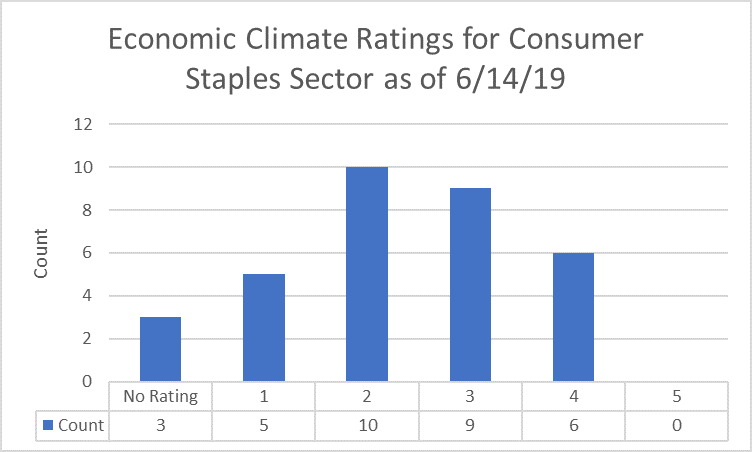
The Economic Climate Rating (ECR) measures how favorable the current economic climate could be for an asset (i.e., a stock) over the next 6 to 12 months. It is a 5-star scale: 1 being the worst, 5 being the best. Tyson Foods’ ECR is a 4 meaning that the current economy could be considered favorable for the company. Exporting the FiveRisks report by MacroRisk Analytics to an Excel spreadsheet, we can summarize the ECRs as follows:

The distribution of the ratings is positively skewed meaning that there are more companies in the consumer staples sector with ratings below 3. This may indicate that currently, the economy is expected to be neutral or not favorable to the majority of companies in that sector.

Economy’s Influence

The Economy’s Influence shows how much of an asset’s price and value movement is explained by changes in the economy. Our model indicates 82% of Tyson Foods’ stock price is explained by changes in the economy, and we attribute the other 18% to company-specific information. This is a relatively low number because the average portion of the stock price movement that is explained by the economy in the consumer staples sector as of 6/14/19 is approximately 88%. Our model indicates that about 20% of the companies (i.e., their stock prices) in the sector are less influenced by the economy and about 80% of the companies (i.e., their stock prices) are more influenced by the economy.

Eta® Profile

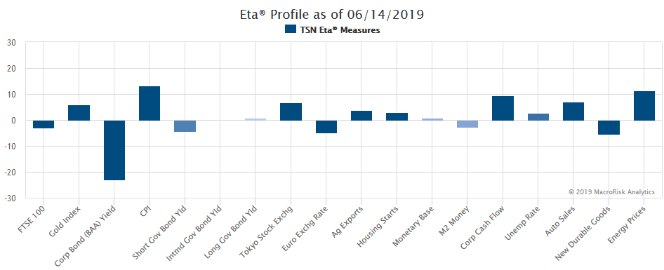
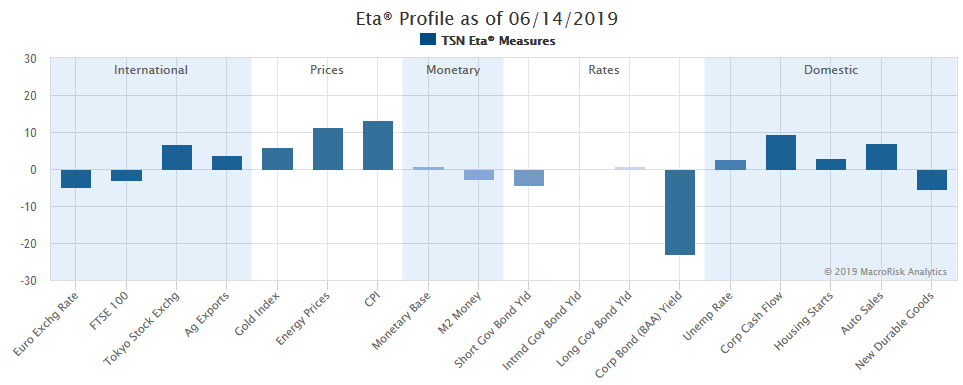
Finally, we would like to show another patented, proprietary economic analysis for Tyson Foods. And, it is the Eta® profile or what we call the “DNA” of the company. If you are a new reader and would like to learn how to understand the Eta® profile, click here. Here’s the Eta® profile for Tyson Foods:

Currently, the company’s top 3 sensitivities are to:

  • corporate bond (BAA) yield
  • CPI (inflation)
  • energy prices

Tyson’s stock price is negatively influenced by the BAA yield meaning that if the BAA yield were to decrease, this would be expected to benefit the stock’s price and vice versa. On the other hand, it is positively influenced by the CPI and energy prices meaning that if these two factors were to increase, this would be expected to benefit the stock’s price and vice versa.

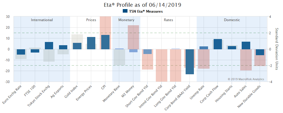
Here’s a variation of the Eta® profile where the current economic status is also presented:

It can be seen that the BAA yield has actually decreased (see the direction of the non-blue bar for the BAA yield factor in the chart above), and the CPI and energy prices have increased relative to their recent levels.

Here’s a graph of Tyson’s stock price versus the S&P 500 Total Return Index from 12/29/2017 through 6/14/2019:

MacroRisk Analytics has a selection of proprietary analysis tools that use macroeconomic variables to provide information on tens of thousands of stocks, mutual funds, exchange traded funds, and other traded assets.  By using these tools to evaluate Tyson Foods (TSN), we believe that the company has lower overall economic risk, and a more favorable macroeconomic status compared to other companies in its sector.  A more detailed examination shows that recent changes in the CPI and Corporate Bond Yields have particular impact. Click here to see how MacroRisk Analytics can help you. 

Stocks with Highest and Lowest Return-to-risk Ratios Year-to-date

Using analysis provided by MacroRisk Analytics, we have identified 10 stocks selected from the S&P 500 Index with positive returns year-to-date that have the highest and lowest return-to-risk ratios.

We frequently see stock rankings which show best and worst performers for different time periods in terms of return. We believe that it may be as important to rank investments in terms of return-to-risk ratio. This ratio identifies how much return an investment provided per unit of risk taken. For instance, if investment A had a return of 10% and a standard deviation (risk) of 20%, its return-to-risk ratio would be 0.5.  Suppose instead, we consider investment B which had a return of 10% and a standard deviation of 15%.  Investment B’s return-to-risk ratio is 0.67. In other words, investment B might be viewed as a better investment in this scenario because it had a higher return-to-risk ratio. Even though both investments had the same return (10 %), investment B had a lower risk as measured by standard deviation.

Let’s take a look at a common performance benchmark, the S&P 500 Total Return Index and see how it has performed so far this year (12/31/18 through 6/10/19). We like this benchmark because it includes both price change and dividends paid to measure total return whereas the S&P 500 Index only shows the price change (or a fraction of the return that an investor would receive were he or she to invest in the index).

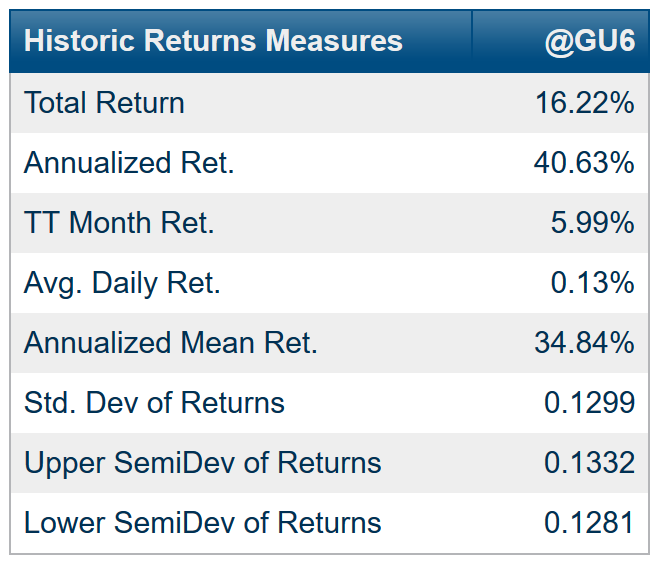
The year-to-date return (through 6/10/19) for the S&P 500 Total Return Index is 16.22%. Quite a stellar run coming after a dismal performance in the fourth quarter of 2018 during when this index dropped by 13.52%.

As we did earlier with our two hypothetical investments, to calculate the return-to-risk ratio for the index, we take the annualized mean return (34.84%) and divide by the standard deviation (12.99% annualized) year-to-date. The return-to-risk ratio is 2.68 (= 34.84% / 12.99%).

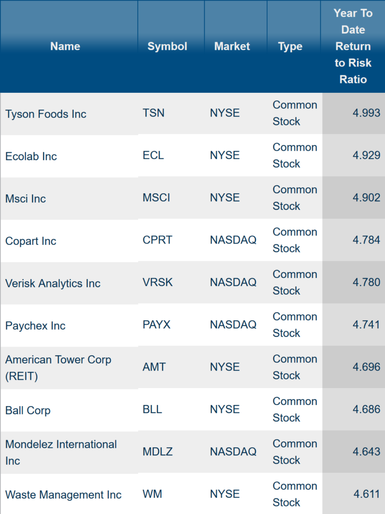
Now, let’s take a look at the 10 stocks out of the S&P 500 with positive returns year-to-date that have the highest return-to-risk ratios. With the help from MacroRisk Analytics, this can be done quickly using the screening tool:

The best performer year-to-date in terms of return-to-risk ratio is Tyson Foods Inc. which is in the consumer staples sector.

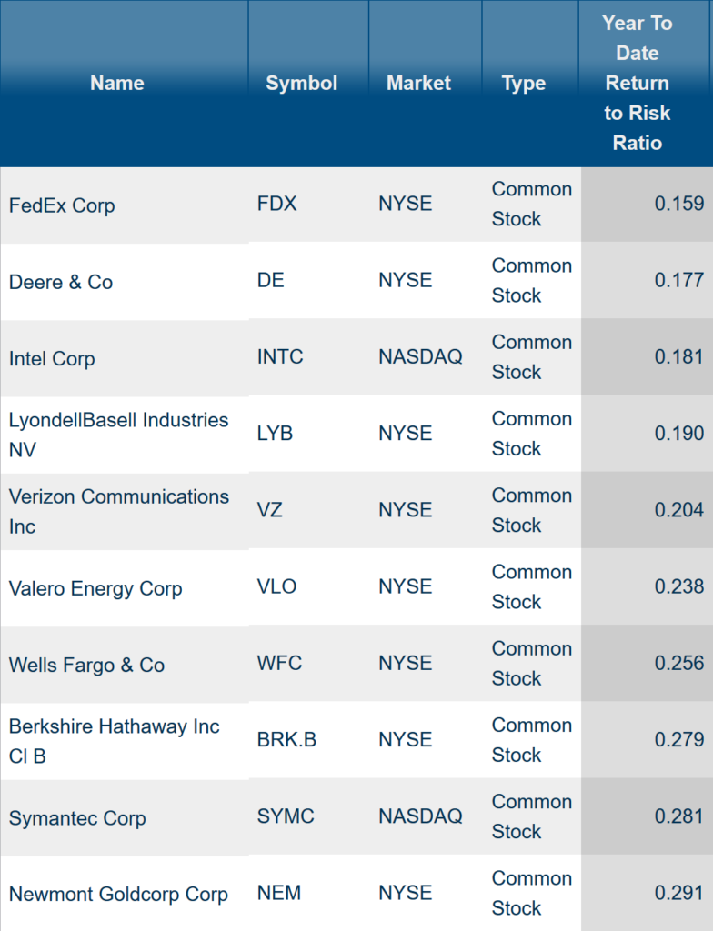
Using the MacroRisk Analytics screening tool, we also identified the 10 stocks out of the S&P 500 with positive returns that have the lowest return-to-risk ratios year-to-date:

Out of S&P 500 companies with positive return year-to-date, the worst performer in terms of return-to-risk ratio is FedEx Corp which is in the Industrials sector.

The goal of this post was to show companies that have provided the highest and lowest return per unit of risk taken (focusing only on those companies had positive returns year-to-date). Of course, this information is historic and in no way should be considered indicative of the future performance. Nonetheless, it might be worthwhile to be aware of these companies and try to understand why these companies have performed the way they did. In our upcoming blog posts, we will dive into some of the companies shown in this post using MacroRisk Analytics software.

If you would like to check out the tools provided by MacroRisk Analytics, click here.

As the economy changes, which stocks are most and least exposed?

After a time of seemingly economic stability, the potential for economic shock is growing.  With looming trade wars and trade war disruptions, concerns over interest rates, and the usual turmoil going into a presidential election cycle, we used the MacroRisk platform to identify the ten S&P stocks with the highest exposure to 18 key economic factors and the 10 with the lowest exposure to these factors.

The MacroRisk platform provides daily estimates of a “MacroRisk level” for almost every traded U.S. and Canadian stock and fund, using a proprietary set of 18 “Eta® Factors” including International factors (Euro, FTSE100, Tokyo Stock Exchange, and Ag Exports), Prices (Energy, CPI, Gold), Monetary factors (Monetary Base and M2), and Domestic factors (unemployment rate, corporate cash flow, auto sales, and orders for new durable goods).  The “MacroRisk Level” measures the overall exposure of assets and portfolios to these 18 factors.

For comparison, here are the current values of several key indices:

Index MacroRisk Level
Russell Midcap 46
S&P Equal Weight 47
Wilshire 5000 49
Russell 1000 55
S&P 500 59
MSCI Emerging Markets 61
NASDAQ Comp 62
S&P MidCap 400 69
Dow Jones 30 75
Russell 2000 106

We then used the MacroRisk.com platform and screened over the current constituents of the S&P 500 index and identified the following as the stocks with the greatest exposure:

Name Symbol MacroRisk Level
Nektar Therapeutics NKTR 939
ABIOMED Inc ABMD 552
Micron Technology Inc MU 502
Align Technology Inc ALGN 479
Hollyfrontier Corp HFC 478
Netflix Inc NFLX 477
Advanced Micro Devices Inc AMD 475
IPG Photonics Corp IPGP 456
Xilinx Inc XLNX 422
Anadarko Petroleum Corp APC 415

The following are the lowest ten in terms of MacroRisk level:

Name Symbol MacroRisk Level
Westar Energy Inc EVRG 61
Loews Corp L 62
Torchmark Corp TMK 65
Omnicom Group Inc OMC 70
Intercontinental Exchange Inc ICE 71
AFLAC Inc AFL 74
Digital Realty Trust Inc DLR 76
Alexandria Real Estate Equities Inc ARE 78
Huntington Bancshares Inc HBAN 78
Boston Properties Inc BXP 79

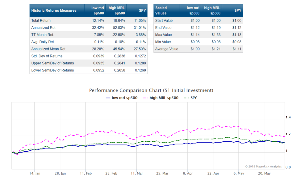
The following chart shows some summary statistics and the graphical presentation of an equally weighted portfolio of the ten highest MacroRisk Level stocks, the ten lowest MacroRisk Level stocks, and the SPY as a measure of overall market attainability.

A final measure is to compute the ratio of the total return to the corresponding standard deviation of returns for the low exposure, high exposure, and SPY portfolios.  This measure is like a Sharpe ratio and measures return per unit risk.

Using this method, the return to risk ratio for the SPY is 0.916, the ratio for the high exposure portfolio is 0.657, and the ratio for the low exposure portfolio is 1.293 using data from 1/1/2019 through the end of May.

While the SPY and high exposure portfolios have generally produced higher returns over this period, the smooth dark blue line, the low MacroRisk Level stocks, produced a superior risk adjusted return. Investors interested in diversifying away exposure to economic exposure during the coming months may want to consider this type of analysis using www.MacroRisk.com.